
How long has it been since you looked at or updated your website? You might be surprised to hear that if it has been more than a year or two, it is outdated. Web site trends change from year to year and you want to keep up with modern web design to get the most out of your website.
Many businesses ignore their website for a variety of reasons:
- Lack of understanding of the importance of a modern website
- Feel it’s too much work or that it’s overwhelming to re-do their website
- Worried that it will be too expensive to update
- Not top of mind
- Lack of time to deal with it
For digital marketing purposes, your website is critical for success. If you want to grow your business, or at a minimum not lose opportunities; your website needs to be kept updated.
Homepage redesign and branding
One solution that we've found for businesses that are unsure about redoing their entire website, is to do a modern homepage redesign and branding exercise.
During the branding process, we uncover the WHY (are you doing it), HOW (process) and WHAT (you do). Sections of the home page are built specifically to align with the buyer journey, which begins with the WHY, then the HOW and finally the WHAT.
New web design requires a different layout than a few years ago. There are specific factors that go into the design and help cover what’s needed for your brand and user experience. The modern home page should be a scroll down experience that provides a lot of information about the business and its products or services, instead of a short page that requires clicking to other pages for information. Users don't like to click on links so we put more into the home page so people can find the information more quickly and easily. The home page is now a road map or highway with turnoffs, rather than a parking lot.
The body of the home page should be the meat of the content. More detailed and specific for content consumption.
CTA buttons are placed strategically to direct traffic based on the buyer journey, buyer persona, or other showcasing like featured offers.
Toward the bottom of the home page is the perfect place to add credibility like testimonials and accreditation logos.
At the very bottom there should be a call-to-action catchall button to move the visitors further into the website.
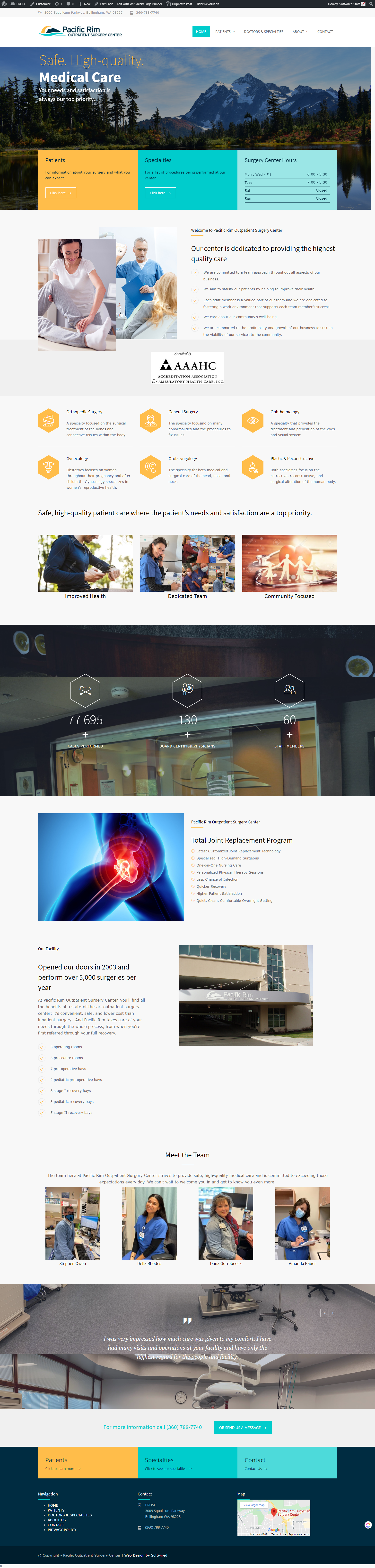
PROSC homepage redesign
We recently completed a homepage redesign for Pacific Rim Outpatient Surgery Center in Bellingham, Washington. We worked with them to identify their WHY, HOW and WHAT and then laid the information out in a scrolling style home page with plenty of appealing visuals and calls-to action.
The WHY is: Our Center Is Dedicated to Providing the Highest Quality Care with bullet points outlining company mission and values.
The How is: An infographic that talks about 130+ board-certified physicians and 60 staff members.
The What is: An infographic list of the types of surgeries offered at the facility.
Next comes an About Us section that talks about the facility and team
Toward the bottom are testimonials and the page is finished off with the catchall call-to-action button.
You can see the before and after here.
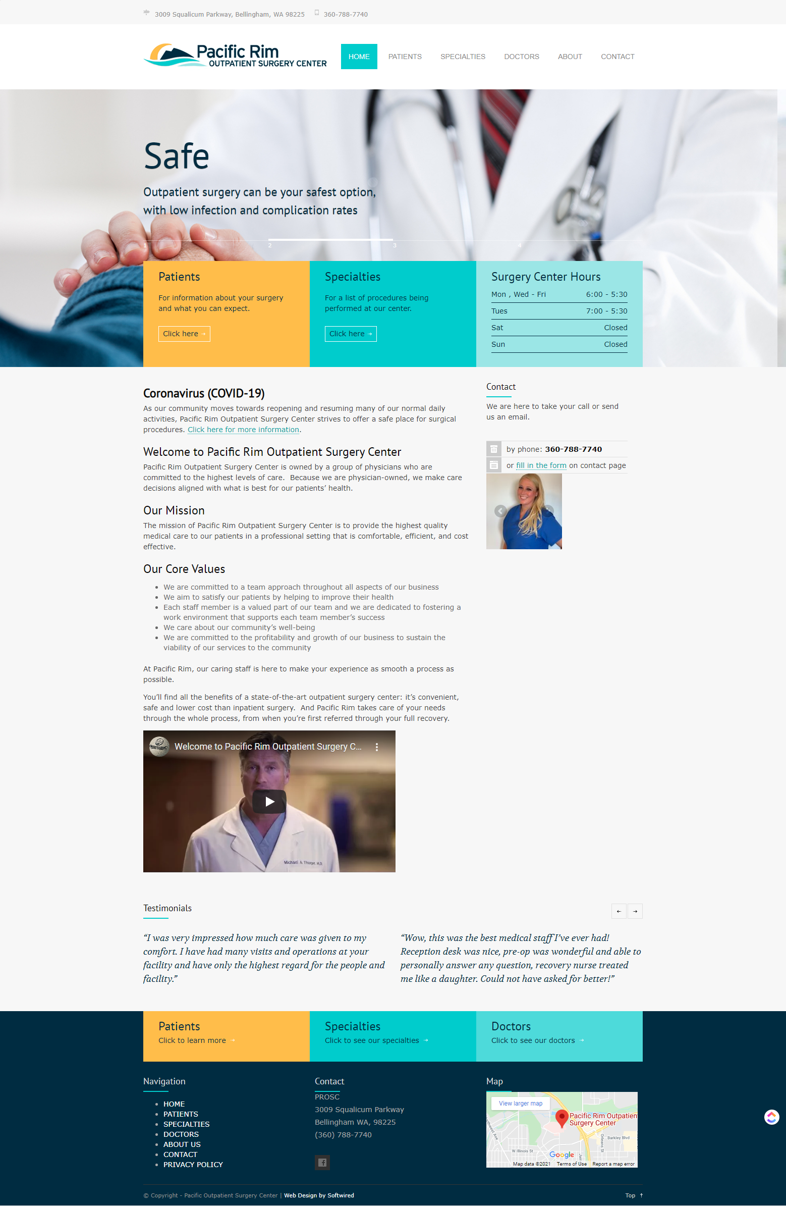
Before:
After:
Web design expertise
If it’s time for a new website or homepage redesign, please contact our team of web design and digital marketing experts. We are ready to make your website fresh, modern and functional to ensure that visitors are getting the best impression possible of your business and will be more likely to want to do business with you.

Let Us Know What You Thought about this Post.
Put your Comment Below.